Quaderns de Psicologia | 2025, Vol. 27, Nro. 2, e2141 | ISSN: 0211-3481 | ![]()
 https://doi.org/10.5565/rev/qpsicologia.e2141

Explore the Popularity and Emotional Association of Colours in the Generation Z Cohort
Explorar la popularidad y la asociación emocional de los colores en la cohorte de la Generación Z
Marián Čvirik
University of Economics in Bratislava
Abstract
This paper deals with the issue of colours and their perception based on cognitive and affective components of attitudes. The aim of the article is (1) to investigate the popularity of the colours of generation Z in Slovakia; (2) to investigate the direction (positivity or negativity) of emotions that are associated with colours; and (3) to verify possible connections between the degree of popularity and the direction of emotions of colours in the studied cohort. The paper is based on primary empirical research based on a representative sample of the Generation Z cohort. Colours were defined based on hex code and RGB. We process the results using the tools of descriptive statistics, cluster analysis, and correspondence analysis. The results indicate that black is currently the most popular colour. However, understanding the symbolism of colours is key. The results can be implemented not only within psychology but also in other humanities.
Keywords: Sensory colour perception; Generation Z; Cognitive and affective aspect; Consumer psychology
Resumen
Este artículo aborda la percepción del color desde los componentes cognitivos y afectivos de las actitudes. Su objetivo es (1) analizar la popularidad de los colores entre jóvenes de la Generación Z en Eslovaquia; (2) examinar la dirección (positiva o negativa) de las emociones asociadas a dichos colores; y (3) verificar posibles vínculos entre el grado de popularidad y la orientación emocional. El estudio se basa en una investigación empírica primaria con una muestra representativa de esta cohorte. Los colores se definieron mediante códigos hexadecimales y RGB. Se aplicaron estadística descriptiva, análisis de conglomerados y análisis de correspondencias. Los resultados señalan que el negro es el color más popular en la actualidad. No obstante, comprender la simbología de los colores resulta fundamental. Los hallazgos pueden aplicarse tanto en la psicología como en otras disciplinas de las humanidades.
Palavras-chave: Percepción sensorial del color; Generación Z; Aspecto cognitivo y afectivo; Psicología del consumidor
Introduction
In general, we can recognise more than 7 million colours. Generic colours can include red, yellow, and blue, as they form the basis for all other shades, and at the same time, they cannot be created by combining other colours. Mixing two primary colours produces secondary colours, which include purple (red and blue), orange (red and yellow), and green (yellow and blue) (Marks & Sutton, 2009).
Colours can be divided from the point of view of the contrasting characteristics of the shade, namely into warm, cold, and neutral. Warm colours are perceived as high-energy colours. These colours are used in creative professions where dynamism and energy need to be highlighted (Sendra & Carbonell-Barrachina, 2017). This group of colours attracts consumers regardless of their colour preferences, helping to attract customers, encourage them to make impulse purchases, and make quick purchase decisions. On the contrary, in situations where there is a need to think more deeply about the purchase, they lead to premature termination of the shopping trip. Therefore, they are a suitable choice in the exhibition area of trade (Di Folco & Proust, 2014).
Cool colours are considered muted colours. They are preferred in sectors such as advocacy, conservative banking sectors and the like (Sendra & Carbonell-Barrachina, 2017). These colours help in purchases, where a deeper consideration is needed when deciding (Di Folco & Proust, 2014). In addition to warm and cool colours, neutral colours can also be identified, which include white, black, and grey. Few authors have investigated the connections between colours and emotions. In scientific practice, however, there is still a great untapped potential for colour research (De Cock et al., 2020). Perception and emotion (and their eventual nexus) to colours have not been sufficiently explored. Colours have a certain symbolic meaning for people, which is influenced by many determinants. As a determinant, we can determine empiricism, culture, demography, and personal association; in other words, different people can perceive the same colour differently (Chen et al., 2020). At the same time, the perception of colours and their emotional associations changes over time (Dannhoferová, 2012; Gasparyan & Asatryan, 2016), which indicates the need for constant research and, at the same time, the importance of age segmentation. In general, younger children are attracted to strong, warm, and intense colours (Gasparyan & Asatryan, 2016), suggesting the importance of age segmentation in colour exploration. Another determinant can be saturation, whereby high colour saturation is often associated with positive emotions and colours with low saturation, on the contrary, with soft or negative emotions (Ginting-Szczesny, 2022). Domicele Jonauskaite et al. (2019) report that light colours are associated with pleasant emotions, while dark colours are associated with negative emotions. In the context of colour perception, there are differences in terms of demographic factors; specifically, differences in colour perception based on age and gender factors have been proven (César Machado et al., 2021; Maule et al., 2023). Differences in colour perception from the point of view of age are caused by ageing and the wear of receptors. According to anthropologists, gender differences are caused by evolutionary predispositions. Women as fruit pickers needed to distinguish a wider palette of colours for the purpose of recognising ripe fruits from unripe ones. Differences can also be found in colour blindness. Men are colorblind more often than women. Colour blindness affects approximately 8% of men but only 0.5% of women. It can also be considered interesting that around 12% of women have four types of rods in their eyes (instead of three), which gives them the opportunity to distinguish up to a hundred times wider range of colours (Halička, 2019). Similarly, the symbolism of colours can cause certain emotional associations. For example, black and grey create negative emotions as they are associated (in terms of our culture) with death and darkness (Adams & Helfand, 2017). The symbolism of colours is dealt with by a number of scientists (e.g., Elliot, 2015; Gruber et al., 2024; Hultén et al., 2009; Jonauskaite & Mohr, 2025 and others), whose work we will build on. Colour and its symbolism are used in psychology and sociology, but also in marketing, for example in the creation of company logos, store design, marketing communications, company products, and product packaging. Colour perception can be based on cultural predispositions (Kawai et al., 2023), and culture can be a significant factor in behaviour (Kita et al., 2023), thus bringing personality values not only in the field of psychology, but also in the context of marketing and business (Krowicki & Maciejewski, 2023).
The aim of the article is (1) to investigate the popularity of the colours of generation Z in Slovakia; (2) to investigate the direction (positivity or negativity) of emotions that are associated with colours; and (3) to verify possible connections between the degree of popularity and the direction of emotions of colours in the studied cohort.
Based on the presented overview of scientific and professional literature, as well as on the formulated goal, we created the following research questions (RQ) and hypothesis (H) for the comprehensive fulfilment of the aim:
RQ1: How it can be evaluated the popularity of colours within Generation Z in Slovakia?
RQ2: How can colours be grouped in the context of their popularity?
RQ3: How can the emotional perception of colours be evaluated within Generation Z in Slovakia?
RQ4: How can colours be grouped in the context of their emotional impact?
RQ5: How can one understand the connection between popularity and perception of emotions within generation Z in Slovakia?
H1: There is a relationship between the popularity of colours and their emotional perception.
Methodology
The base consisted of 179 respondents from Generation Z. We only work with a part of Generation Z, namely the population aged 15 to 29 years (Benítez-Márquez et al., 2022; Naďová Krošláková et al., 2024), however, we work with the 18 to 29-year-old population, which is part of Generation Z referred to as young adults (Coulaud et al., 2023; Lindsay et al., 2023). The reason for adjusting the lower interval is, on the one hand, the ethics of the research, and at the same time, it concerns adult respondents who have formed their opinions as well as a comprehensive view of the world. In the paper, weight conversion for gender is used to achieve representativeness in this factor. In the population, the gender distribution can be identified at roughly the level of 51% men and 49% women (Statistical Office of the Slovak Republic, 2023). In weight calculations, it is recommended by default to “never to weight a respondent less than 0.5 nor more than 2” (Elliott, 2020, p. 1). This general rule was observed in our case. Weights themselves do not affect all statistical procedures, but to clarify the methodology, it is appropriate to state that weights were used in all analyses performed.
The article is supported by the results of the primary survey, which consisted of three parts. The first part focuses on the popularity of colours on a five-point scale. The second part focuses on the investigation of the perception of emotions resulting from the eleven colours investigated. Based on scientific recommendations (e.g., Jonauskaite et al., 2019), we examine emotions as positive and negative, while the degree of perception is categorised into five scale levels, namely: very negative, negative, neutral, positive, and very positive. The third part focuses on the respondents’ characteristics, such as age and gender. It should be noted that for this type of paper, it is not appropriate to use the word “red”, as the respondent can imagine a different shade of colour under this term. Therefore, the respondents were provided with a sample of the colours on which they commented. Colours were defined with the help of RGB codes, which were subsequently transformed into HEX codes, as they were used both in print and online form. We specified the definition of colours in Table 1.
Table 1. Defining the investigated colours
Colour |
HEX code |
RGB |
Black |
# 000000 |
(0, 0, 0) |
Blue |
# 0000FF |
(0, 0, 255) |
Brown |
# 964B00 |
(150, 75, 0) |
Gray |
# 808080 |
(128, 128, 128) |
Green |
# 00FF00 |
(0, 255, 0) |
Orange |
# FFA500 |
(255, 165, 0) |
Pink |
# FFC0CB |
(255, 192, 203) |
Purple |
# 800080 |
(128, 0, 128) |
Red |
# FF0000 |
(255, 0, 0) |
White |
# FFFFFF |
(255, 255, 255) |
Yellow |
# ffff00 |
(255, 255, 0) |
On the basis of Table 1, the used colour can be clearly defined. It should be noted that in the work we use self-reports, which represent certain limits (Dasborough et al., 2008), when only verbal stimuli could distort the results. Direct visual interaction is thus a suitable means to mitigate the limits of self-reports (Müller & Kappas, 2010; Höllerer et al., 2019).
For the needs of information processing, we use general scientific-philosophical methods, which include analysis, synthesis, deduction, and scientific abstraction. As part of the results of the work, we use mathematical and statistical methods. We make extensive use of descriptive statistics (Čvirik & Ölveczká, 2022). We use the correlation coefficient (Spearman’s Rho) to investigate connections, while we verify this coefficient for the need to generalise to the entire population with the help of inferential statistics. For grouping, we use cluster analysis (Čvirik & Ölveczká, 2023). The Wards method was chosen as the cluster analysis method, as its algorithm is complex and suitable for this type of task. Due to the nature of the data (ordinal data), we used the Chi squared measure. Since it is a hierarchical method, the output of which can be graphically visualised with the help of a dendrogram (Čvirik & Ölveczká, 2023), we use this visualisation for a simpler and clearer clarification of the results. For the overall display of colour preferences and emotional perception of colours, we used correspondence analysis (CA), the significant advantage of which is a clear output in the form of a factor map (Greenacre, 2010), which, in our understanding, represents the colour perception map of the studied cohort.
Results and discussion
The paper can be divided into three parts according to the formulated goal, while the first part focuses on the popularity of the colour, the second part focuses on emotions, and the third part examines the possible connections between popularity and emotions. In the next part of the paper, we will proceed logically in terms of the set research questions and hypotheses that will help us in the comprehensive fulfilment of the aim.
RQ1: How can it be evaluated the popularity of colours within Generation Z in Slovakia?
The liking of (eleven) colours was examined using a bipolar five-point scale, with one pole representing “I don’t like it at all” (representing a value of 1) and the other pole representing “I like it very much” (representing a value of 5). We processed the basic overview of descriptive statistics in Table 2.
Table 2. Basic overview of colour popularity rate
Colour |
Min |
Max |
Mean |
Std. Dev. |
Median |
Like_Black |
2 |
5 |
4.37 |
0.82 |
5 |
Like_Blue |
1 |
5 |
4.18 |
0.82 |
4 |
Like_Brown |
1 |
5 |
2.91 |
1.17 |
3 |
Like_Gray |
1 |
5 |
3.42 |
1.13 |
4 |
Like_Green |
1 |
5 |
3.60 |
0.92 |
4 |
Like_Orange |
1 |
5 |
2.87 |
0.98 |
3 |
Like_Pink |
1 |
5 |
3.26 |
1.26 |
3 |
Like_Purple |
1 |
5 |
3.37 |
1.10 |
3 |
Like_Red |
1 |
5 |
3.47 |
1.01 |
4 |
Like_White |
2 |
5 |
4.18 |
0.77 |
4 |
Like_Yellow |
1 |
5 |
3.14 |
1.10 |
3 |
As Table 2 indicates, respondents largely used maximum evaluations and, in addition to black and white evaluations, also maximum negative evaluations. Due to the ordinal scale, the mean has a considerably limited interpretation. However, it is possible to evaluate whether, on average, the respondents are more inclined towards popularity of the given colour, while the middle of the scale represents a value of three points. It can be observed that, on average, the worst perceived colours are orange and brown. The most popular colour (on the basis of median and mean) is black. The standard deviation indicates that the greatest variation from the mean can be expected in pink, and the most consistent responses can be identified in white.
RQ2: How can colours be grouped in the context of their popularity?
We use cluster analysis for grouping. The Wards method was chosen as the cluster analysis method, as its algorithm is complex and suitable for this type of task. Due to the nature of the data (ordinal data), we used the Chi-squared measure. Since it is a hierarchical clustering method, the result can be visualised in the form of a dendrogram. The dendrogram is shown in Figure 1.
Figure 1. Dendrogram using Ward Linkage for measuring the popularity of selected colours
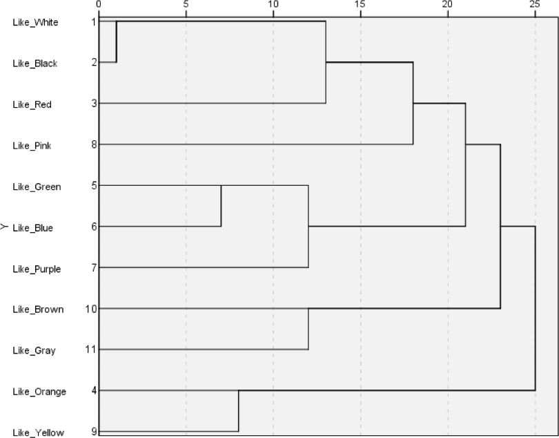
Source: Own processing in SPSS.
The clustering results shown on the dendrogram as well as the overall clustering results point to the suitability of the interpretation with the rescaled distance cluster combined with a value of 20. Four clusters are thus created. The first cluster is made up of white, black, red, and pink; the second cluster consists of green, blue, and purple; the third cluster consists of brown and grey; and the fourth cluster consists of orange and yellow. The dendrogram shows us the great similarity of white and black within the first cluster, which should be taken into consideration during interpretations. It can be assumed that the colour rating contains a latent variable, namely hue, except for the first cluster, which can be labelled “current trend”.
RQ3: How can the emotional perception of colours be evaluated within Generation Z in Slovakia?
An important element in the use of colours is their symbolism and the associations that arise from them. In this context of the result is a certain emotion, while it is appropriate to distinguish between negative and positive emotions (affects) (Jonauskaite et al., 2019). We examined emotions on the basis of a bipolar scale, which contained five degrees. One pole represented “maximum negative emotions” (representing a value of 1), and the other pole represented “maximum positive emotions” (representing a value of 5). We processed the basic overview of descriptive statistics in Table 3.
Table 3. Basic overview of the measure of emotional association with colour
Colour |
Minimum |
Maximum |
Mean |
Std. Dev. |
Median |
EMO_Black |
1 |
5 |
2.72 |
1.11 |
3 |
EMO_Blue |
1 |
5 |
3.51 |
0.88 |
4 |
EMO_Brown |
1 |
5 |
3.14 |
1.01 |
3 |
EMO_Gray |
1 |
5 |
2.94 |
1.04 |
3 |
EMO_Green |
2 |
5 |
4.00 |
0.86 |
4 |
EMO_Orange |
1 |
5 |
3.75 |
0.96 |
4 |
EMO_Pink |
1 |
5 |
3.85 |
0.98 |
4 |
EMO_Purple |
1 |
5 |
3.17 |
0.93 |
3 |
EMO_Red |
1 |
5 |
3.63 |
1.04 |
4 |
EMO_White |
1 |
5 |
3.72 |
0.99 |
4 |
EMO_Yellow |
1 |
5 |
4.11 |
0.89 |
4 |
As the results from Table 3 indicate, in the context of minimum and maximum evaluation, respondents used extreme values in all cases, except for green, which did not reach the maximum negative perception. It can be assumed that the symbolism of the colour green, as “colours of hope” or “colours of nature,” predisposes it to positive emotions. Below the middle value of the used scale (3 points), we identified only two colours on average, namely black and grey. These colours have the symbolism of sadness, death, or misfortune in our conditions. It can therefore be assumed that it was this symbolism that caused them to move towards negative emotions. Yellow and green can be described as the most positive (on average), and their symbolism is related to energy. In general, it can be stated that there is agreement with the statements of study Bernadetta A. Ginting-Szczesny (2022).
RQ4: How can colours be grouped in the context of their emotional impact?
Again, we used cluster analysis to address this research question, using hierarchical cluster analysis. The clustering method was the Wards method, and the distance measurement method was the Chi squared measure. We recorded the result of the analysis in the form of a dendrogram in Figure 2.
Figure 2. Dendrogram using Ward Linkage for the Emotions of Colours
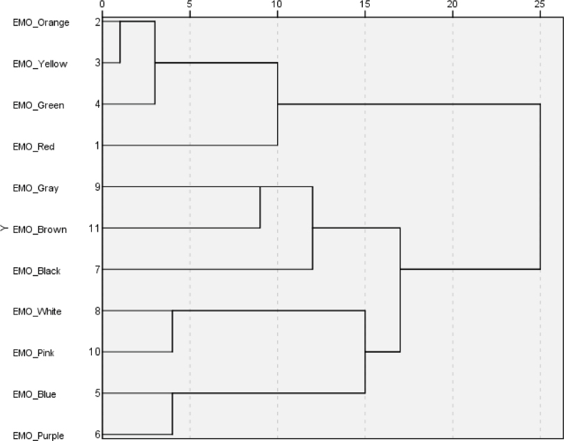
Source: Own processing in SPSS.
In the context of Figure 2, three clusters can be considered, with the first cluster representing the grouping of orange, yellow, green, and red; the second cluster representing grey, brown, and black; and the third cluster representing white, pink, blue, and purple. The first cluster can be described as colours that are associated with highly positive emotions. The second cluster, on the other hand, represents colours associated with rather negative emotions. The third cluster is a grouping of colours associated with positive emotions. Within individual clusters, the effect of colour symbolism can be observed, while shade also plays a certain role.
RQ5: How can one understand the connection between popularity and perception of emotions within generation Z in Slovakia?
First of all, we wanted to examine the overall situation of perceptions of popularity and emotional feelings in the context of colours. For this purpose, it is advisable to create a perception map. However, it is necessary to state that, due to the intensity of the five-level scale, our model is multidimensional. For its easy visualisation, we chose correspondence analysis (CA), with which we display our model in two dimensions for an overview of perceptions in the studied cohort. The key result of CA is the factor map, which we have shown in figure 3.
Figure 3. CA factor map
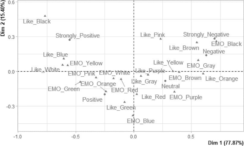
Source: own processing in R.
First of all, it is necessary to comment on the quality of the correspondence analysis (Figure 3). As we can see, dimension 1 (Dim 1) explains 77.87%, and the second dimension (Dim 2) explains 15.4%, which indicates that our model explains a total of 93.27% of variance, which is more than acceptable considering the number of variables and their presentation in two dimensions. We can also notice that the level of perception (measure of positivity or negativity) is presented mainly by dimension 1, while its shape has the form of a parabola, and from left to right it goes from strongly positive to positive, neutral to negative, and strongly negative. The capture of individual measures (based on ctr. and cos2) is reliable. However, the capture of individual colours varies considerably. However, the visualisation can be considered indicative and indicates the state of capturing the perception of intensity and direction of popularity and emotional indication.
In this context, it is also important to consider that it is necessary to investigate individual colours separately and thus create paired observations on emotional perception and popularity. For example, we can see a significant contradiction with the colour black when its popularity is very high, but its emotional perception is significantly negative.
H1: There is a relationship between the popularity of colours and their emotional perception
When investigating the connections between the popularity and emotions of colours, we used Spearman’s rho due to the nature of the variables. At the same time, we also used an element of statistical testing (inferential statistics) to investigate the possibility of generalising the results to the population. We recorded the results for individual colours in Table 4.
Table 4. Spearman’s Rho coefficient for the level of popularity and emotions of individual colours
Colour |
Correlation Coefficient |
Sig. (2-tailed) |
Black |
0.281** |
1.7E-05 |
Blue |
0.253** |
0.0001 |
Brown |
0.384** |
2.4E-09 |
Gray |
0.233** |
0.0004 |
Green |
0.128 |
0.0556 |
Orange |
0.326** |
5.4E-07 |
Pink |
0.483** |
1.3E-14 |
Purple |
0.374** |
6.7E-09 |
Red |
0.253** |
0.0001 |
White |
0.193** |
0.0035 |
Yellow |
0.247** |
0.0002 |
**. Correlation is significant at the 0.01 level (2-tailed).
Source: Own processing in SPSS.
Considering the setting of the scales, we can state that the greater the popularity of colours identified, the more colours were associated with more positive emotions. The results from Table 4 indicate a small to moderately strong positive association between liking and the emotion associated with individual colours. In addition to the colour green, we can also generalise the results to the population. The colour green appears to be specific in this context, achieving a very low degree of contiguity. The statistical test points to the possibility that this association may not exist in the population. The greatest degree of connection is achieved by the colour pink, which is currently very popular among Generation Z and is also associated with positive emotions.
Conclusion
The aim of the article was (1) to investigate the popularity of the colours of generation Z in Slovakia; (2) to investigate the direction of (positive and negative) emotions associated with colours; and (3) to verify possible connections between the degree of popularity and the direction of emotions associated with colours in the studied cohort.
The article is supported by a primary survey of 179 respondents from generation Z in Slovakia. As the sample does not reflect the parameters of the population, we used weight conversions to obtain representativeness with regard to gender, which is an important factor in colour perception (Jacobs et al., 1991). As part of the first part of the goal, we identified colour popularity measures. The results indicate that black is currently one of the most popular colours, followed by white and blue, in the studied cohort. We also identified four groups of colours based on the similarity of their perceived popularity. We also investigated the emotional perception of colours, which indicates negative emotional associations with black and grey and, conversely, a high degree of positive association with yellow and green. Within the emotion-based colour grouping, we identified three clusters. In general, it can be assumed that the current fashion trend (Di Folco & Proust, 2014), as well as the symbolism of colours (Ardila-Leal et al., 2021; Mackenzie, 1922), have a significant effect on both the popularity of colours and emotional perception. As part of the results, we also offer a clear map of the perception of preferences and emotional indications of the studied cohort.
The results of the article can be applied in several areas. In psychology, the results can be used to improve the emotional state of the young generation, which is marked by psychological problems (Achterbergh et al., 2020; Garrido et al., 2019). The results can also help in marketing communication using elements of sensory marketing, which include colour (Lim et al., 2020; Rathee & Rajain, 2019). In this context, we can talk about the connection between sensory and emotional marketing. In the same way, grouping of colours can help with colour combinations, for example, in the creation of product design as well as in marketing communication policy.
This paper also contains certain limitations. The paper focuses on the general perception of basic colours. In the future, it would be appropriate to investigate other colour shades as well as specify lightness and colour tones. In the future, it would be appropriate to investigate not only the influence of demographic factors but also the current emotional state of the respondents, for example, with the help of Beck’s anxiety inventory. Due to the clear definition of colours, research in other countries and subsequent comparisons are also possible. In general, emotional aspects are significantly connected to sensory perceptions, but they are still insufficiently researched (Čvirik, 2024), and the article contributes to this knowledge base and thus creates topics for further research.
Acknowledgements
We would like to thank the editor as well as the anonymous reviewers who contributed to improving the article with their advice. The paper is output from projects from ESG – Early Stage Grant supported by the Deputy Prime Minister for the EU Recovery Plan and the Knowledge Economy, number A-24-102/0025-00 “Strategic, intervention, and adaptation possibilities of consumer ethnocentrism in the context of digital and international marketing management” and number A-25-102/3020-15 “Enhancement of retail business models based on sensory, digital, and geographic marketing management through modern approaches in market research and statistical data analysis”.
References
Achterbergh, Louis; Pitman, Alexandra; Birken, Mary; Pearce, Eiluned; Sno, Herman, & Johnson, Sonia. (2020). The experience of loneliness among young people with depression: A qualitative meta-synthesis of the literature. BMC Psychiatry, 20(1), 415.
Adams, Sean, & Helfand, Jessica. (2017). The designer’s dictionary of color. Abrams.
Ardila-Leal, Leidy D.; Poutou-Piñales, Raúl A.; Pedroza-Rodríguez, Aura M., & Quevedo-Hidalgo, Balkys E. (2021). A brief history of colour, the environmental impact of synthetic dyes and removal by using laccases. Molecules, 26(13), 3813. https://doi.org/10.3390/molecules26133813
Benítez-Márquez, María Dolores; Sánchez-Teba, Eva María; Bermúdez-González, Guillermo, & Núñez-Rydman, Emma Sofía. (2022). Generation Z within the workforce and in the workplace: A bibliometric analysis. Frontiers in Psychology, 12, 736820. https://doi.org/10.3389/fpsyg.2021.736820
César Machado, Joana; Fonseca, Beatriz, & Martins, Carla. (2021). Brand logo and brand gender: Examining the effects of natural logo designs and color on brand gender perceptions and affect. Journal of Brand Management, 28(2), 152–170. https://doi.org/10.1057/s41262-020-00216-4
Chen, Yun; Yang, Jie; Pan, Qianqian; Vazirian, Marjan, & Westland, Stephen. (2020). A method for exploring word‐colour associations. Color Research & Application, 45(1), 85–94. https://doi.org/10.1002/col.22434
Coulaud, Pierre-Julien; Jesson, Julie; Bolduc, Naseeb; Ferlatte, Olivier; Jenkins, Emily; Bertrand, Karine; Salway, Travis; Jauffret-Roustide, Marie, & Knight, Rod. (2023). Young adults’ mental health and unmet service needs in the context of the COVID-19 pandemic across Canada and France. Community Mental Health Journal, 59(2), 222–232. https://doi.org/10.1007/s10597-022-01000-1
Čvirik, Marián. (2024). The importance of music as a mood regulator: Adaptation of Music in Mood Regulation Scale in the conditions of Slovakia. Ceskoslovenska Psychologie, 68(3), 255–272. https://doi.org/10.51561/cspsych.68.3.255
Čvirik, Marián, & Ölveczká, Diana. (2022). Úvod do kvantitatívnych metód: Generický prehľad. Ekonomika cestovného ruchu a podnikanie, 14(1), 7–15.
Čvirik, Marián, & Ölveczká, Diana. (2023). A generic view of cluster analysis. Ekonomika cestovného ruchu a podnikanie, 15(1), 25–31.
Dannhoferová, Jana. (2012). Velká kniha barev: Kompletní průvodce pro grafiky, fotografy a designéry (1. vyd). Computer Press.
Dasborough, Marie T.; Sinclair, Marta; Russell-Bennett, Rebekah, & Tombs, Alastair. (2008). Measuring emotion: Methodological issues and alternatives. En Neal M. Ashkanasy & Cary L. Cooper (Eds.), Research companion to emotion in organizations (pp. 403–435). Edward Elgar Publishing. https://doi.org/10.4337/9781848443778.00021
De Cock, Robin; Denoo, Lien, & Clarysse, Bart. (2020). Surviving the emotional rollercoaster called entrepreneurship: The role of emotion regulation. Journal of Business Venturing, 35(2), 105936. https://doi.org/10.1016/j.jbusvent.2019.04.004
Di Folco, Marine, & Proust, Maëlle. (2014). Colour trends in marketing: The case of companies’ logos. Halmstad University. [online]. [cit. 2024-03-03]. https://www.diva-portal.org/smash/get/diva2:733903/FULLTEXT01.pdf
Elliot, Andrew J. (2015). Color and psychological functioning: A review of theoretical and empirical work. Frontiers in Psychology, 6, 368. https://doi.org/10.3389/fpsyg.2015.00368
Elliott, Roxana. (2020). Weighting survey data: Methods and advantages. [online]. [cit. 2024-01-03]. Available at: https://www.geopoll.com/blog/weighting-survey-data-raking-cell-weighting/
Garrido, Sandra; Millington, Chris; Cheers, Daniel; Boydell, Katherine; Schubert, Emery; Meade, Tanya, & Nguyen, Quang Vinh. (2019). What works and what doesn’t work? A systematic review of digital mental health interventions for depression and anxiety in young people. Frontiers in Psychiatry, 10, 759. https://doi.org/10.3389/fpsyt.2019.00759
Gasparyan, Naira, & Asatryan, Karine. (2016). Colour symbolism and its cognitive cultural message. Scientific-Methodological Journal, 3. 6–14.
Ginting-Szczesny, Bernadetta A. (2022). Giving colour to emotions in entrepreneurship. Journal of Business Venturing Insights, 17, e00302. https://doi.org/10.1016/j.jbvi.2021.e00302
Greenacre, Michael J. (2010). Correspondence analysis. WIREs Computational Statistics, 2(5), 613–619. https://doi.org/10.1002/wics.114
Gruber, Robert; Häfner, Michael, & Kachel, Sven. (2024). Dressing up social psychology: Empirically investigating the psychological functions of clothing using the example of symbolic protection. British Journal of Social Psychology, 63(2), 1003–1035. https://doi.org/10.1111/bjso.12700
Halička, Juraj. (2019). Farby neexistujú. Prečo ich teda vidíme? [online]. [cit. 2024-01-09]. Available at: https://blog.sme.sk/halicka/veda-a-technika/farby-neexistuju-preco-ich-teda-vidime
Höllerer, Markus A.; Van Leeuwen, Theo; Jancsary, Dennis; Meyer, Renate E.; Andersen, Thomas Hestbaek, & Vaara, Eero. (2019). Visual and multimodal research in organization and management studies (1st ed., pp. 244). Routledge. https://doi.org/10.4324/9781315455013
Hultén, Bertil; Broweus, Niklas, & Dijk, Marcus van. (2009). Sensory marketing. Palgrave Macmillan.
Jacobs, Laurence; Keown, Carles; Worthley, Reginald, & Ghymn, Kyung-Il. (1991). Cross‐cultural colour comparisons: Global marketers beware! International Marketing Review, 8(3). https://doi.org/10.1108/02651339110137279
Jonauskaite, Domicele; Althaus, Betty; Dael, Nele; Dan-Glauser, Elise, & Mohr, Christine. (2019). What color do you feel? Color choices are driven by mood. Color Research & Application, 44(2), 272–284. https://doi.org/10.1002/col.22327
Jonauskaite, Domicele, & Mohr, Christine. (2025). Do we feel colours? A systematic review of 128 years of psychological research linking colours and emotions. Psychonomic Bulletin & Review. Advance online publication. https://doi.org/10.3758/s13423-024-02615-z
Kawai, Claudia; Zhang, Yang; Lukács, Gáspár; Chu, Wenyi; Zheng, Chaoyi; Gao, Cijun; Gozli, Davood; Wang, Yonghui, & Ansorge, Ulrich. (2023). The good, the bad, and the red: Implicit color-valence associations across cultures. Psychological Research, 87(3), 704–724. https://doi.org/10.1007/s00426-022-01697-5
Kita, Pavol; Žambochová, Marta; Maciejewski, Grzegorz; Čvirik, Marián, & Mazalánová, Veronika K. (2023). Changes in the culture of consumption during COVID-19: A decision-tree model. Cultural Management: Science and Education, 7(1), 85–101. https://doi.org/10.30819/cmse.7-1.06
Krowicki, Piotr, & Maciejewski, Grzegorz. (2023). Shopping centre marketing: Value creation and customer engagement (1st ed.). Routledge. https://doi.org/10.4324/9781032690544
Lim, Dongjae; Baek, Tae Hyun; Yoon, Sukki, & Kim, Yeonshin. (2020). Colour effects in green advertising. International Journal of Consumer Studies, 44(6), 552–562. https://doi.org/10.1111/ijcs.12589
Lindsay, Sally; Fuentes, Kristina; Tomas, Vanessa, & Hsu, Shaelynn. (2023). Ableism and workplace discrimination among youth and young adults with disabilities: A systematic review. Journal of Occupational Rehabilitation, 33(1), 20–36. https://doi.org/10.1007/s10926-022-10049-4
Mackenzie, Donald A. (1922). Colour symbolism. Folklore, 33(2), 136–169. https://doi.org/10.1080/0015587X.1922.9719237
Marks, Terry, & Sutton, Tina (Ed.). (2009). Color harmony compendium: A complete color reference for designers of all types. Rockport Pub.
Maule, John; Skelton, Alice E., & Franklin, Anna. (2023). The development of color perception and cognition. Annual Review of Psychology, 74(1), 87–111. https://doi.org/10.1146/annurev-psych-032720-040512
Müller, Marion G., & Kappas, Arvid. (2010). Visual emotions – Emotional visuals: Emotions, pathos formulae, and their relevance for communication research. In Katrin Döveling, Christian von Scheve & Elly A. Konijn (Eds.), The Routledge handbook of emotions and mass media (pp. 310–331). Routledge.
Naďová Krošláková, Monika; Čvirik, Marián, & Manuel Guaita Martínez, José. (2024). Intervention and adaptation options for measuring brand trust in the context of its dimensionality with an emphasis on the generational context. ESIC Market, 55(2), e328. https://doi.org/10.7200/esicm.55.328
Rathee, Rupa, & Rajain, Pallavi. (2019). Role colour plays in influencing consumer behaviour. International Research Journal of Business Studies, 12(3), 209–222.
Sendra, Esther, & Carbonell-Barrachina, Ángel A. (Ed.). (2017). Sensory and aroma marketing. Wageningen Academic Publishers.
Statistical Office of the Slovak Republic. (2023). https://datacube.statistics.sk/#!/view/sk/SODB/hc1okr/Obyvate%C4%BEstvo%20pod%C4%BEa%20miesta%20s%C4%8D%C3%ADtania,%20pohl.,%20postav.%20v%20dom%C3%A1c.,%20rodinn.%20stavu,%20ekonom.aktivity,%20miesta%20narod.,%20%C5%A1t%C3%A1t.%20pr%C3%ADslu%C5%A1.%20a%20veku%20-%20HC1
Marián Čvirik
Marián Čvirik is an associate professor at the University of Economics in Bratislava. He specializes in sensory perceptions and their multidisciplinary applications, with an emphasis on the fields of marketing, psychology, musicology and sociology.
marian.cvirik@euba.sk
https://orcid.org/0000-0003-4701-1543
Formato de citación
Čvirik, Marián (2025). Explore the Popularity and Emotional Association of Colours in the Generation Z Cohort. Quaderns de Psicologia, 27(2), e2141.
https://doi.org/10.5565/rev/qpsi-cologia.2141
Historia editorial
Recibido: 03-03-2024
1ª revisión: 28-02-2025
Aceptado: 06-03-2025
Publicado: 29-08-2025